Widgets API
Reference documentation for custom Qt widgets.
Table of Contents
Widget Architecture
Base Widget Principles
All custom widgets follow these design principles:
Separation of Concerns: UI logic separate from business logic
Signal-Based Communication: Use Qt signals for events
Stateful Design: Widgets maintain their own state
Reusability: Can be used in multiple contexts
Styling: Support theme-based styling via stylesheets
Common Widget Pattern
from PyQt6.QtWidgets import QWidget
from PyQt6.QtCore import pyqtSignal

class CustomWidget(QWidget):
    # Define signals
    value_changed = pyqtSignal(object)
    error_occurred = pyqtSignal(str)

    def __init__(self, parent=None):
        super().__init__(parent)
        self._value = None
        self.setup_ui()
        self.connect_signals()

    def setup_ui(self):
        """Initialize UI components"""
        pass

    def connect_signals(self):
        """Connect internal signals"""
        pass

    def get_value(self):
        """Get widget value"""
        return self._value

    def set_value(self, value):
        """Set widget value"""
        self._value = value
        self.value_changed.emit(value)
Enhanced Parameter Widgets
components/widgets/enhanced_parameter_widgets.py
Widgets with advanced features like validation, tooltips, and constraints.
FloatParameterWidget
Float input with range validation.
from components.widgets.enhanced_parameter_widgets import FloatParameterWidget

widget = FloatParameterWidget(
    label='Lambda (λ)',
    default_value=1e5,
    min_value=1e2,
    max_value=1e9,
    decimals=2,
    scientific=True,
    tooltip='Smoothness parameter for AsLS baseline correction',
    parent=self
)

# Connect signal
widget.value_changed.connect(lambda v: print(f"Lambda changed to {v}"))

# Get/set value
value = widget.get_value()
widget.set_value(1e6)
Features:
Scientific notation support
Range validation
Decimal precision control
Real-time validation feedback
Tooltip on hover
Signals:
value_changed(float): Emitted when value changesvalidation_failed(str): Emitted when validation fails
Methods:
get_value() -> float
Get current value.
set_value(value: float)
Set value programmatically.
reset_to_default()
Reset to default value.
validate() -> bool
Validate current value against constraints.
set_range(min_value: float, max_value: float)
Update value range.
widget.set_range(1e3, 1e8)
IntParameterWidget
Integer input with range validation.
from components.widgets.enhanced_parameter_widgets import IntParameterWidget

widget = IntParameterWidget(
    label='Window Length',
    default_value=11,
    min_value=5,
    max_value=51,
    step=2,  # Only odd values
    tooltip='Savitzky-Golay window size (must be odd)',
    parent=self
)
Parameters:
label(str): Display labeldefault_value(int): Initial valuemin_value(int): Minimum allowed valuemax_value(int): Maximum allowed valuestep(int, default=1): Increment steptooltip(str, optional): Help textparent(QWidget, optional): Parent widget
Validation: Automatically ensures value is within range and follows step increment
BoolParameterWidget
Boolean checkbox with label.
from components.widgets.enhanced_parameter_widgets import BoolParameterWidget

widget = BoolParameterWidget(
    label='Whiten',
    default_value=False,
    tooltip='Whiten principal components to unit variance',
    parent=self
)

# Get value
is_checked = widget.get_value()  # Returns bool
Features:
Clear on/off state
Optional description text
Signal on state change
ChoiceParameterWidget
Dropdown/combobox for multiple options.
from components.widgets.enhanced_parameter_widgets import ChoiceParameterWidget

widget = ChoiceParameterWidget(
    label='Kernel',
    choices=['linear', 'rbf', 'poly', 'sigmoid'],
    default_value='rbf',
    tooltip='SVM kernel function',
    parent=self
)

# Get selected value
kernel = widget.get_value()  # Returns str
Parameters:
label(str): Display labelchoices(List[str]): Available optionsdefault_value(str): Initial selectiontooltip(str, optional): Help textparent(QWidget, optional): Parent widget
Methods:
add_choice(choice: str)
Add new option to dropdown.
widget.add_choice('precomputed')
remove_choice(choice: str)
Remove option from dropdown.
widget.remove_choice('sigmoid')
set_choices(choices: List[str])
Replace all choices.
widget.set_choices(['option1', 'option2', 'option3'])
StringParameterWidget
Text input with optional validation.
from components.widgets.enhanced_parameter_widgets import StringParameterWidget

widget = StringParameterWidget(
    label='Group Name',
    default_value='',
    placeholder='Enter group name',
    validator=r'^[A-Za-z0-9_]+$',  # Alphanumeric and underscore only
    tooltip='Unique identifier for sample group',
    parent=self
)
Parameters:
label(str): Display labeldefault_value(str): Initial textplaceholder(str, optional): Placeholder textvalidator(str or QValidator, optional): Validation pattern (regex or Qt validator)tooltip(str, optional): Help textparent(QWidget, optional): Parent widget
Validation: Real-time validation with visual feedback (red border on invalid)
RangeParameterWidget
Dual slider for selecting value range.
from components.widgets.enhanced_parameter_widgets import RangeParameterWidget

widget = RangeParameterWidget(
    label='Wavenumber Range',
    min_value=400,
    max_value=4000,
    default_range=(600, 1800),
    tooltip='Spectral region to analyze',
    parent=self
)

# Get selected range
min_wn, max_wn = widget.get_value()  # Returns tuple
Features:
Dual slider handles
Numeric input boxes
Range validation (min < max)
Visual range indicator
Constrained Parameter Widgets
components/widgets/constrained_parameter_widgets.py
Widgets with built-in parameter constraints based on method requirements.
ConstrainedFloatWidget
Float widget with method-specific constraints.
from components.widgets.constrained_parameter_widgets import ConstrainedFloatWidget

widget = ConstrainedFloatWidget(
    method='asls',
    parameter='lambda',
    parent=self
)

# Constraints loaded from functions/preprocess/parameter_constraints.py
# lambda for AsLS: min=1e2, max=1e9, default=1e5
Features:
Automatic constraint loading
Method-specific validation
Default value from method spec
Warning on out-of-range values
Methods:
load_constraints(method: str, parameter: str)
Load constraints for specific method/parameter.
widget.load_constraints('savgol', 'window_length')
get_constraint_info() -> dict
Get constraint metadata.
info = widget.get_constraint_info()

# Returns:
# {
#     'min': 5,
#     'max': 51,
#     'default': 11,
#     'must_be_odd': True,
#     'description': 'Window size for Savitzky-Golay filter',
#     'recommended_range': (7, 21)
# }
AutoValidatingComboBox
Combobox with automatic value validation.
from components.widgets.constrained_parameter_widgets import AutoValidatingComboBox

widget = AutoValidatingComboBox(
    method='hierarchical_clustering',
    parameter='linkage',
    parent=self
)

# Automatically populated with valid choices: ['ward', 'complete', 'average', 'single']
Features:
Auto-populate from method spec
Invalid selection prevention
Contextual help for each option
Icons and Resources
components/widgets/icons.py
Icon management and resource loading.
get_icon()
Get icon by name.
from components.widgets.icons import get_icon

# Get standard icon
home_icon = get_icon('home')
save_icon = get_icon('save')

# Use in button
button = QPushButton(home_icon, 'Home')
Available Icons:
'home','save','open','export''play','pause','stop','refresh''add','remove','edit','delete''settings','help','info','warning','error''up','down','left','right''zoom_in','zoom_out','fit'
Parameters:
name(str): Icon namesize(int, default=24): Icon size in pixelscolor(str, optional): Icon color (for SVG icons)
Returns: QIcon
get_themed_icon()
Get icon matching current theme.
from components.widgets.icons import get_themed_icon

# Returns light or dark version based on current theme
icon = get_themed_icon('folder', theme='dark')
Parameters:
name(str): Icon nametheme(str, optional): Theme (‘light’, ‘dark’, ‘auto’)size(int, default=24): Icon size
Returns: QIcon
Matplotlib Widget
components/widgets/matplotlib_widget.py
Enhanced matplotlib integration for Qt.
MatplotlibWidget
Embeddable matplotlib figure.
from components.widgets.matplotlib_widget import MatplotlibWidget

plot_widget = MatplotlibWidget(parent=self)

# Get axes
ax = plot_widget.get_axes()

# Plot data
ax.plot([1, 2, 3], [4, 5, 6])
plot_widget.refresh()
Features:
Embedded matplotlib canvas
Navigation toolbar
Interactive zoom/pan
Export to file
Multi-subplot support
Methods:
get_axes() -> matplotlib.axes.Axes
Get main axes object.
ax = plot_widget.get_axes()
ax.plot(x, y)
get_figure() -> matplotlib.figure.Figure
Get figure object.
fig = plot_widget.get_figure()
fig.suptitle('My Plot')
clear()
Clear all plotted data.
plot_widget.clear()
refresh()
Redraw canvas.
ax.plot(new_x, new_y)
plot_widget.refresh()
save_figure(filepath: str, dpi: int = 300)
Save figure to file.
plot_widget.save_figure('output/plot.png', dpi=300)
Supported formats: PNG, PDF, SVG, JPG
add_subplot(nrows: int, ncols: int, index: int) -> matplotlib.axes.Axes
Add subplot.
# Create 2x2 grid
ax1 = plot_widget.add_subplot(2, 2, 1)
ax2 = plot_widget.add_subplot(2, 2, 2)
ax3 = plot_widget.add_subplot(2, 2, 3)
ax4 = plot_widget.add_subplot(2, 2, 4)

ax1.plot(x1, y1)
ax2.plot(x2, y2)
plot_widget.refresh()
enable_toolbar(enabled: bool = True)
Show/hide navigation toolbar.
plot_widget.enable_toolbar(False) # Hide toolbar
set_tight_layout(enabled: bool = True)
Enable tight layout (auto-adjust spacing).
plot_widget.set_tight_layout(True)
InteractivePlot
Plot widget with additional interactivity.
from components.widgets.matplotlib_widget import InteractivePlot

plot = InteractivePlot(parent=self)

# Enable interactive features
plot.enable_zoom_region()
plot.enable_point_picker()
plot.enable_crosshair()

# Connect signals
plot.region_selected.connect(lambda x1, x2: print(f"Region: {x1} - {x2}"))
plot.point_picked.connect(lambda x, y: print(f"Point: ({x}, {y})"))
Features:
Region selection
Point picking
Crosshair cursor
Data cursor (hover tooltips)
Click events
Signals:
region_selected(float, float): Zoom region selected (x1, x2)point_picked(float, float): Point clicked (x, y)mouse_moved(float, float): Mouse position (x, y)
Methods:
enable_zoom_region(enabled: bool = True)
Enable region zoom with mouse drag.
enable_point_picker(enabled: bool = True, tolerance: int = 5)
Enable point picking on click.
enable_crosshair(enabled: bool = True)
Enable crosshair cursor.
enable_data_cursor(enabled: bool = True)
Enable hover tooltips showing (x, y) coordinates.
Component Selector Panel
components/widgets/component_selector_panel.py
Advanced pipeline builder with drag-and-drop.
ComponentSelectorPanel
Complete pipeline construction interface.
from components.widgets.component_selector_panel import ComponentSelectorPanel

panel = ComponentSelectorPanel(parent=self)

# Load available methods
panel.load_methods({
    'Baseline': ['asls', 'airpls', 'polynomial'],
    'Smoothing': ['savgol', 'gaussian', 'median'],
    'Normalization': ['vector_norm', 'snv', 'msc']
})

# Get pipeline
pipeline = panel.get_pipeline()
Features:
Category-based method organization
Drag-and-drop ordering
Parameter editing per step
Step enable/disable
Template pipelines
Pipeline validation
UI Components:
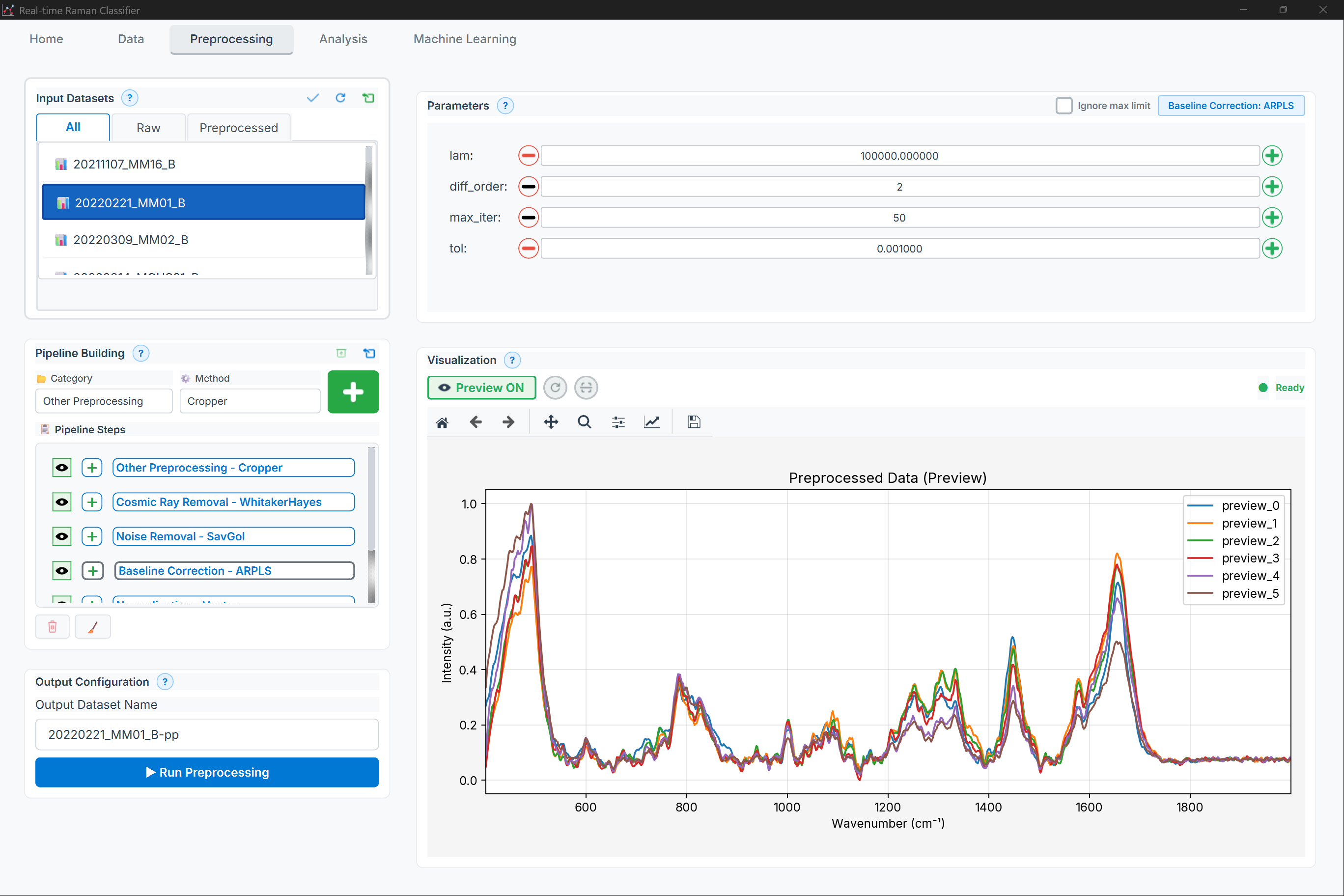
Figure: Preprocessing page showing the pipeline builder (method categories, available methods, and pipeline steps)
Layout (high level):
Method categories (tabs)
Available methods list + add
Pipeline steps list (enable/disable, reorder, settings)
Methods:
load_methods(methods: Dict[str, List[str]])
Load available methods by category.
panel.load_methods({
    'Baseline': ['asls', 'airpls', 'polynomial', 'whittaker'],
    'Smoothing': ['savgol', 'gaussian', 'median', 'moving_average'],
    'Normalization': ['vector_norm', 'minmax', 'snv', 'msc']
})
add_step(method: str, params: dict = None, enabled: bool = True) -> int
Add pipeline step.
step_id = panel.add_step(
    method='asls',
    params={'lambda': 1e5, 'p': 0.01},
    enabled=True
)
Returns: int - Step ID
remove_step(step_id: int)
Remove step from pipeline.
move_step_up(step_id: int)
Move step earlier in pipeline.
move_step_down(step_id: int)
Move step later in pipeline.
toggle_step(step_id: int)
Enable/disable step.
panel.toggle_step(step_id) # Toggle current state
edit_step_params(step_id: int)
Open parameter editor dialog for step.
panel.edit_step_params(step_id)
get_pipeline() -> List[dict]
Get complete pipeline configuration.
pipeline = panel.get_pipeline()

# Returns:
# [
#     {
#         'id': 0,
#         'method': 'asls',
#         'params': {'lambda': 1e5, 'p': 0.01},
#         'enabled': True
#     },
#     {
#         'id': 1,
#         'method': 'savgol',
#         'params': {'window_length': 11, 'polyorder': 3},
#         'enabled': True
#     }
# ]
set_pipeline(pipeline: List[dict])
Load pipeline configuration.
panel.set_pipeline([
    {'method': 'asls', 'params': {'lambda': 1e5, 'p': 0.01}},
    {'method': 'vector_norm', 'params': {}}
])
clear_pipeline()
Remove all steps.
load_template(template_name: str)
Load predefined pipeline template.
panel.load_template('standard')
Available Templates:
'standard': AsLS + SavGol + Vector norm'minimal': AirPLS + Vector norm'aggressive': AsLS + Median + Gaussian + SNV'derivative': AsLS + SavGol 1st derivative + Vector norm'chemometric': MSC + SavGol + Mean center
save_template(template_name: str, description: str = '')
Save current pipeline as template.
panel.save_template(
    'my_custom_template',
    description='Optimized for bacterial samples'
)
validate_pipeline() -> Tuple[bool, List[str]]
Validate pipeline configuration.
is_valid, errors = panel.validate_pipeline()

if not is_valid:
    for error in errors:
        print(f"Pipeline error: {error}")
Checks:
No duplicate methods (where not allowed)
Parameter values in valid ranges
Step order makes sense
Required dependencies present
Signals:
pipeline_changed(): Pipeline modifiedstep_added(int): Step added (step_id)step_removed(int): Step removed (step_id)step_edited(int): Step parameters edited (step_id)
Results Panel Details
components/widgets/results_panel.py
Comprehensive result display widget.
ResultsPanel
Multi-tab result viewer.
from components.widgets.results_panel import ResultsPanel

panel = ResultsPanel(parent=self)

# Display results
panel.set_classification_results(ml_results)
panel.set_pca_results(pca_results)
panel.set_clustering_results(cluster_results)

# Export
panel.export_all('results/analysis', format='xlsx')
Tabs:
Summary: Key metrics overview
Confusion Matrix: Heatmap visualization
ROC Curves: Multi-class ROC curves
Feature Importance: Bar chart or spectrum overlay
Scores Plot: PCA/UMAP/t-SNE scatter
Statistics: Detailed metrics table
Methods:
add_custom_tab(name: str, widget: QWidget)
Add custom result tab.
from PyQt6.QtWidgets import QTextEdit

custom_widget = QTextEdit()
custom_widget.setText("Custom analysis results")

panel.add_custom_tab('Custom Analysis', custom_widget)
get_tab(name: str) -> QWidget
Get tab widget by name.
confusion_tab = panel.get_tab('Confusion Matrix')
remove_tab(name: str)
Remove tab.
panel.remove_tab('Custom Analysis')
clear_all()
Clear all results.
panel.clear_all()
export_current_tab(filepath: str, format: str = 'png')
Export currently visible tab.
panel.export_current_tab('results/confusion_matrix.png', format='png')
export_all(directory: str, format: str = 'xlsx')
Export all results to directory.
panel.export_all('results/session_20260124', format='xlsx')

# Creates:
# - summary.xlsx
# - confusion_matrix.png
# - roc_curves.png
# - feature_importance.png
# - scores_plot.png
Views Widget
components/widgets/views_widget.py
Data table and visualization views.
SpectrumTableView
Table view for spectral data with preview.
from components.widgets.views_widget import SpectrumTableView

table = SpectrumTableView(parent=self)

# Load data
table.set_data(data)

# Connect selection signal
table.selection_changed.connect(self.on_selection_changed)

# Get selected spectra
selected_indices = table.get_selected_indices()
Features:
Sortable columns
Spectrum preview on hover
Multi-selection
Group coloring
Export selection
Columns:
ID: Sample identifier
Label: Sample name
Group: Group assignment
Mean Intensity: Average spectrum intensity
SNR: Signal-to-noise ratio
Peaks: Number of detected peaks
Methods:
set_data(data: dict)
Load spectral data.
get_selected_indices() -> List[int]
Get indices of selected rows.
get_selected_spectra() -> np.ndarray
Get spectra for selected rows.
set_group_colors(colors: Dict[str, str])
Set color for each group.
table.set_group_colors({
    'Control': '#3498db',
    'Treatment': '#e74c3c'
})
export_selected(filepath: str, format: str = 'csv')
Export selected spectra.
table.export_selected('selected_spectra.csv', format='csv')
Signals:
selection_changed(List[int]): Selection changed (selected_indices)row_double_clicked(int): Row double-clicked (index)
Grouping Widgets
components/widgets/grouping/
Widgets for sample grouping and management.
GroupManager
Comprehensive group management interface.
from components.widgets.grouping.group_manager import GroupManager

manager = GroupManager(parent=self)

# Load samples
manager.set_samples(['Sample1', 'Sample2', 'Sample3', ...])

# Create groups
manager.create_group('Control', color='blue')
manager.create_group('Treatment', color='red')

# Assign samples
manager.assign_to_group([0, 1, 2], 'Control')
manager.assign_to_group([3, 4, 5], 'Treatment')

# Get assignments
assignments = manager.get_group_assignments()
# Returns: {'Sample1': 'Control', 'Sample2': 'Control', ...}
UI Layout:

Figure: ML page showing group management and sample assignment controls
Methods:
create_group(name: str, color: str = None, description: str = '')
Create new group.
delete_group(name: str)
Delete group (samples become unassigned).
rename_group(old_name: str, new_name: str)
Rename group.
set_group_color(name: str, color: str)
Set group color.
assign_to_group(sample_indices: List[int], group_name: str)
Assign samples to group.
remove_from_group(sample_indices: List[int])
Remove samples from current group (make unassigned).
get_group_assignments() -> Dict[str, str]
Get sample-to-group mapping.
get_group_sizes() -> Dict[str, int]
Get number of samples per group.
sizes = manager.get_group_sizes()
# Returns: {'Control': 25, 'Treatment': 30, 'Unassigned': 5}
merge_groups(group_names: List[str], new_name: str)
Merge multiple groups.
manager.merge_groups(['Treatment_A', 'Treatment_B'], 'Combined_Treatment')
split_group(group_name: str, ratio: float = 0.5, random_state: int = None)
Split group into two random subgroups.
# Split 'Control' into 'Control_1' and 'Control_2' (50/50)
manager.split_group('Control', ratio=0.5, random_state=42)
validate_groups() -> Tuple[bool, List[str]]
Validate group configuration.
is_valid, warnings = manager.validate_groups()

# Checks:
# - No empty groups
# - Unique group names
# - All samples assigned (if required)
# - Minimum group size met
Signals:
groups_changed(): Group structure modifiedassignment_changed(List[int], str): Samples reassigned (indices, group)group_created(str): New group created (name)group_deleted(str): Group deleted (name)
Custom Dialogs
Parameter Editor Dialog
Advanced parameter editing dialog.
from components.widgets.parameter_widgets import ParameterEditorDialog

dialog = ParameterEditorDialog(
    method='asls',
    current_params={'lambda': 1e5, 'p': 0.01},
    parent=self
)

if dialog.exec() == QDialog.Accepted:
    new_params = dialog.get_parameters()
    print(f"New parameters: {new_params}")
Features:
Auto-generate inputs from method spec
Real-time validation
Help text and tooltips
Reset to defaults button
Parameter range indicators
Method Selection Dialog
Method picker with search and filtering.
from components.widgets.utils import MethodSelectionDialog

dialog = MethodSelectionDialog(
    category='Baseline Correction',
    available_methods=['asls', 'airpls', 'polynomial', 'whittaker'],
    parent=self
)

if dialog.exec() == QDialog.Accepted:
    selected = dialog.get_selected_method()
    print(f"Selected: {selected}")
Features:
Category filtering
Search by name
Method descriptions
Parameter preview
Recently used methods
Widget Styling
Theme Support
Apply consistent styling across all widgets.
from configs.style.stylesheets import apply_theme

# Apply light theme
apply_theme('light', app)

# Apply dark theme
apply_theme('dark', app)

# Custom theme
custom_style = """
QWidget {
    background-color: #2C3E50;
    color: #ECF0F1;
    font-family: 'Segoe UI';
}

QPushButton {
    background-color: #3498DB;
    border: none;
    padding: 8px 16px;
    border-radius: 4px;
}

QPushButton:hover {
    background-color: #2980B9;
}
"""
app.setStyleSheet(custom_style)
Widget-Specific Styling
# Style individual widget
widget.setStyleSheet("""
    QWidget {
        background-color: white;
        border: 1px solid #BDC3C7;
        border-radius: 4px;
    }
""")

# Style specific widget types
FloatParameterWidget.setStyleSheet("""
    FloatParameterWidget QLineEdit {
        border: 1px solid #3498DB;
        padding: 4px;
    }

    FloatParameterWidget QLineEdit:focus {
        border: 2px solid #2980B9;
    }
""")
Best Practices
Widget Design
# Good: Modular, reusable widget
class SpectrumCard(QWidget):
    """Reusable card widget for displaying spectrum summary"""

    clicked = pyqtSignal(int)  # Emit spectrum index

    def __init__(self, spectrum_data, index, parent=None):
        super().__init__(parent)
        self.index = index
        self.setup_ui(spectrum_data)

    def setup_ui(self, data):
        layout = QVBoxLayout(self)
        # Build UI

    def mousePressEvent(self, event):
        self.clicked.emit(self.index)

# Use in list
for i, spectrum in enumerate(spectra):
    card = SpectrumCard(spectrum, i)
    card.clicked.connect(self.on_spectrum_selected)
    list_layout.addWidget(card)
Signal Management
# Good: Clear signal names, typed arguments
class CustomWidget(QWidget):
    value_changed = pyqtSignal(float)      # Single value
    selection_changed = pyqtSignal(list)   # List of indices
    error_occurred = pyqtSignal(str)       # Error message

# Bad: Generic signals
class BadWidget(QWidget):
    changed = pyqtSignal(object)  # What changed? What type?
State Management
# Good: Explicit state handling
class StatefulWidget(QWidget):
    def get_state(self) -> dict:
        """Get widget state for saving"""
        return {
            'value': self.value,
            'selected_items': self.get_selected_items(),
            'view_settings': self.get_view_settings()
        }

    def set_state(self, state: dict):
        """Restore widget state"""
        self.value = state['value']
        self.set_selected_items(state['selected_items'])
        self.apply_view_settings(state['view_settings'])
Performance
# Good: Batch updates
widget.setUpdatesEnabled(False)  # Disable repainting
for item in items:
    widget.add_item(item)
widget.setUpdatesEnabled(True)   # Re-enable and repaint once

# Good: Lazy loading for large datasets
class LazyTableWidget(QTableWidget):
    def __init__(self, data):
        super().__init__()
        self.data = data
        self.load_visible_rows()

    def scrolled(self):
        self.load_visible_rows()  # Only load visible rows
See Also
Core API - Core application modules
Pages API - Application pages
Components API - High-level components
Functions API - Processing functions
Last Updated: 2026-01-24